Perfect Color Schemes for Every Room: A Smart Method
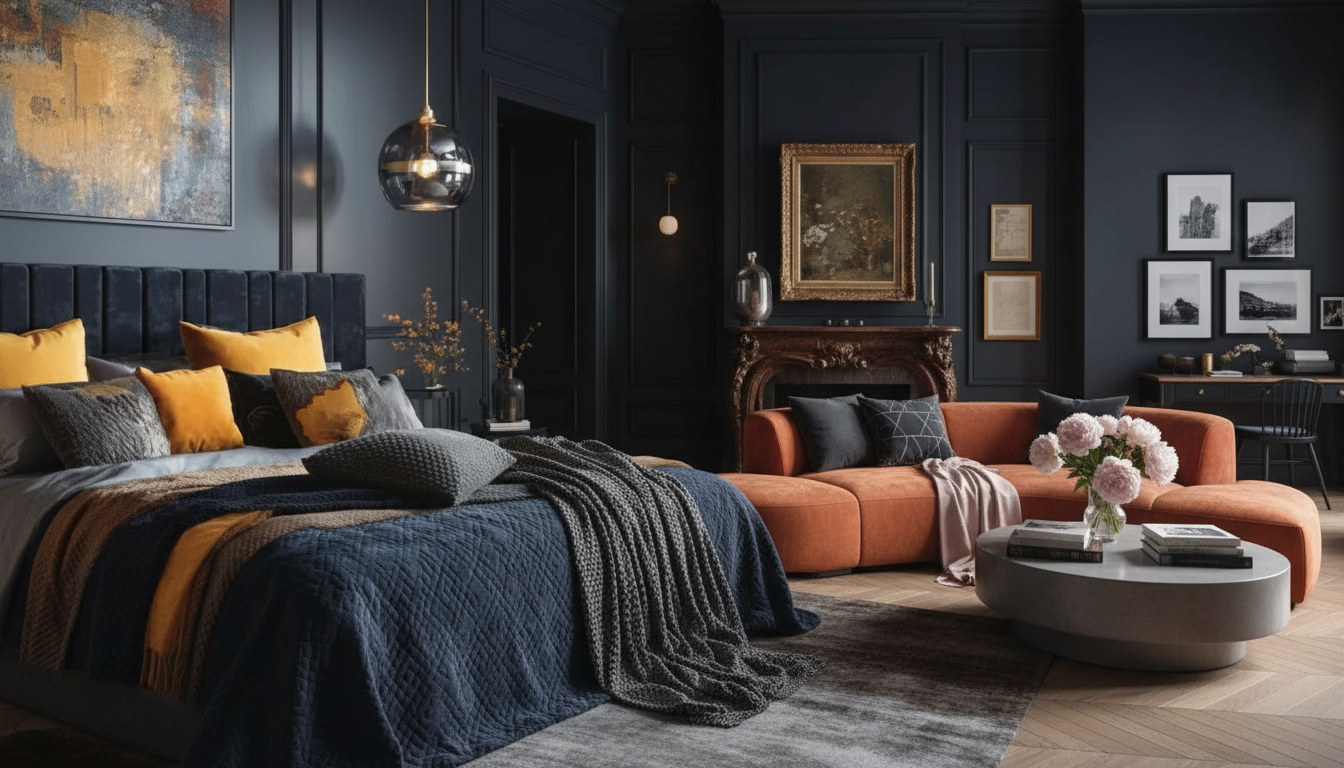
The Smart Guide to Perfect Color Schemes for Every Room
Color can make a home feel calm, bright, grounded, or energetic—but only when the palette is built with intention. A reliable process keeps you from chasing “pretty” paint colors that don’t work once they’re on the wall. Below is a practical, repeatable way to choose colors that play nicely with lighting, fixed finishes, and the mood of each space—then turn inspiration into a paint-and-decor plan without expensive trial and error. For more guidance, see A Guide to Interior Design Research: Color Theory.
Start with the room’s “non-negotiables”
Before picking paint, take inventory of what won’t change soon. These elements are your built-in color cues, and ignoring them is the fastest way to end up with clashing undertones. For further reading, see 12 Essential Books About Color – The Aesthetics of Joy.
- List fixed elements: flooring, large upholstery, tile, countertops, cabinets, brick, and key wood tones.
- Identify the dominant undertone (warm, cool, or neutral). A “neutral” beige can still lean pink, yellow, or green; a gray can lean blue or violet.
- Decide what must blend vs. what can be a statement. Example: the sofa becomes the anchor, while the rug is the hero that supplies pattern and color.
- Collect 5–10 inspiration images that match your non-negotiables rather than fighting them.
If you want a guided workflow that turns those fixed elements into a clean palette you can shop from, The Smart Guide to Perfect Color Schemes (digital download) includes an AI color palette checklist and exercises that help you stay consistent from paint to decor.
Choose a palette structure that’s easy to execute
The most livable rooms usually follow a simple ratio: a dominant base, a supporting secondary, and smaller accents. This keeps the space cohesive even when you add pattern, art, and layered lighting.
- Pick a neutral backbone first (soft white, greige, taupe, charcoal, or warm beige) based on the room’s light and finishes.
- Add a mid-tone that repeats across multiple items (curtains, rug pattern, pillows, art) so the room feels “designed,” not collected at random.
- Reserve bold colors for controlled areas: a single wall, artwork, a pair of chairs, or decor accents that are easy to swap.
- Keep the palette to 3–5 core colors, then vary texture and sheen (matte paint, nubby linen, glossy ceramic) for depth.
| Formula | Best for | Example mix |
|---|---|---|
| 3-color classic | Most rooms and styles | Warm white base + clay mid-tone + deep olive accent |
| Monochrome layers | Small rooms; modern looks | Light gray base + medium gray textiles + black accents |
| High-contrast | Spaces needing drama | Cream base + navy feature + brass/wood accents |
| Nature-led | Relaxed, timeless interiors | Sand base + sage mid-tone + terracotta accents |
For additional color reference systems and tools, browse Pantone or the paint visualization resources from Sherwin-Williams and Benjamin Moore.
Match color to natural light (before buying paint)
Lighting changes everything. A color that looks creamy online can read gray-green in your home, and the shift usually comes down to exposure and time of day.
- North-facing rooms read cooler and darker; warmer neutrals and creamy whites help them feel inviting.
- South-facing rooms get strong light; softer, muted colors prevent glare and over-saturation.
- East-facing rooms swing from warm morning light to cooler afternoon light; test samples in multiple time windows.
- West-facing rooms can look warm and intense later in the day; balance with cooler undertones or grounded mid-tones.
- Test paint with large samples on multiple walls; check with lights on and off.
A practical tip: stand a paint swatch next to your brightest “fixed finish” (countertop, tile, or carpet) and your darkest (sofa, stained wood, or fireplace surround). If the swatch suddenly looks pink, green, icy, or muddy, it’s usually an undertone mismatch—not “bad lighting.”
Use an AI-assisted palette, then validate it in the real room
Digital tools can speed up the early phase, especially when you start from one anchor item you already love. The key is treating AI-generated colors as a draft—then confirming them with real materials.
Room-by-room color moves that rarely fail
Living room
Bedroom
Kitchen
Let hard finishes lead. Match paint to counters and backsplash first, then add color through stools, runners, and ceramics you can swap seasonally. If you’re finalizing seating as part of the plan, How to Pick Dining Chairs Checklist (digital download) helps you coordinate shape, scale, and materials so the chairs support your palette instead of competing with it.
Bathroom
Hallways and open plans
A quick checklist to prevent expensive mistakes
Turn the palette into a shopping plan
For a guided, step-by-step workflow with an AI color palette checklist and ready-to-use exercises, use The Smart Guide to Perfect Color Schemes (digital download) and keep your choices aligned from the first swatch to the final styling pass.
FAQ
How many colors should a room have?
Three to five core colors is a strong target: one dominant base, one supporting secondary, and one or two accents. You can add richness through texture and lighter/darker tints of those same colors without expanding the palette.
How can paint undertones be identified quickly?
Compare the paint chip to a true white and to one warm and one cool reference chip, then view it in daylight and at night. Always check it next to fixed finishes like flooring and countertops, since those materials make undertones more obvious.
What’s the easiest way to make an open-concept space feel cohesive?
Use one connecting neutral across walls or other large surfaces, then repeat one or two accent colors across zones. Keeping metals and key wood tones consistent also helps the whole space read as one plan.












Leave a comment