Luxury Interior Design: High-End Rooms + AI Ideas
A Modern Guide to Luxury Home Interior Design: Elegant Rooms, High-End Details, and AI-Enhanced Inspiration
Luxury interiors feel effortless, but the result is usually a deliberate mix of proportion, restraint, tactile materials, and lighting that flatters every surface. This guide breaks down the core elements behind elegant, high-end rooms—then shows how AI-assisted ideation can speed up concepting while keeping decisions grounded in timeless design principles. For more guidance, see The Best Interior Design Books.
What Makes an Interior Feel Luxurious (Even Before the Furniture Arrives)
Before you add a single decorative object, the “expensive” feeling comes from structure: clear architecture, confident scale, and edited choices. For further reading, see Top 10 Free eBooks About Interior Design You Need To ….
- Prioritize architectural clarity: clean sightlines, consistent trim language, and purposeful negative space keep the room calm and composed.
- Scale and proportion signal quality: larger art, fuller drapery, and correctly sized rugs prevent a “starter home” look.
- Edit aggressively: fewer, better pieces read more elevated than many trendy accessories.
- Balance symmetry with tension: anchor a space with paired elements, then add one sculptural asymmetric moment for character.
A helpful lens is visual hierarchy: when the room has a clear “first read” (hero lighting, statement art, or a strong furniture silhouette), everything else can be quieter and still feel intentional. (See: Nielsen Norman Group — Visual Hierarchy.)
The Luxury Palette: Color That Looks Expensive in Any Light
Color reads “high-end” when undertones agree and contrast stays controlled. The goal isn’t bland—it’s cohesive.
- Build around undertones: align whites, woods, and metals so the room reads cohesive in daylight and warm evening light.
- Use quiet contrast: pair near-neutrals (stone, oat, charcoal) to create depth without harsh transitions.
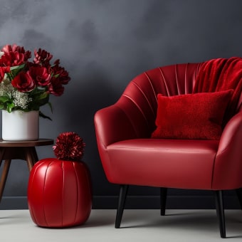
- Reserve saturated color for controlled zones: a lacquered cabinet, a velvet chair, or a single statement wall with art lighting.
- Repeat a signature tone 3–5 times: echo it across textiles, art, and objects for a deliberate rhythm.
Palette shortcuts for polished, high-end rooms
| Look | Core neutrals | Accent colors | Best finishes |
|---|---|---|---|
| Warm modern | Ivory, camel, soft taupe | Olive, oxblood, ink | Brushed brass, walnut, honed stone |
| Cool contemporary | Soft white, greige, charcoal | Cobalt, forest, aubergine | Polished nickel, smoked oak, matte black |
| Monochrome luxe | Cream to espresso | One deep tone (optional) | Plaster, bouclé, leather, ribbed glass |
Materials and Finishes That Elevate Instantly
Luxury is often tactile: surfaces look substantial up close and still read clean from across the room.
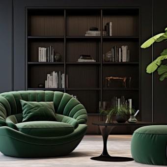
- Mix tactile layers: bouclé, linen, wool, leather, and wood grain add richness without clutter.
- Choose stone thoughtfully: honed marble and quartzite feel quieter and more refined than high-gloss surfaces.
- Limit metals to 1–2 families per room: brass + matte black, or polished nickel + smoked oak, for a composed finish story.
- Upgrade the small touchpoints: hardware, switch plates, faucets, and door levers are high-impact details you touch every day.
If one change needs to do the most work, start with hardware and lighting—those details telegraph quality immediately.
Lighting Like a Designer: Layers, Warmth, and Control
Great lighting is where “nice” becomes “luxurious.” It shapes shadow, makes texture look intentional, and keeps the room flattering at night.
- Use three layers: ambient (overall), task (functional), and accent (art/feature) to add depth.
- Aim for warm, flattering temperature: 2700K–3000K in most living spaces to keep finishes looking rich.
- Install dimmers whenever possible: adjustability is a signature of high-end rooms.
- Add glow points: a pair of lamps, picture lights, or a softly lit niche creates evening sophistication.
For a practical reference on LED color behavior and why warmth matters, see U.S. Department of Energy — LED Color Characteristics. For deeper lighting guidance, the IES Lighting Handbook is a long-standing standard.
Room-by-Room Upgrades That Read High-End
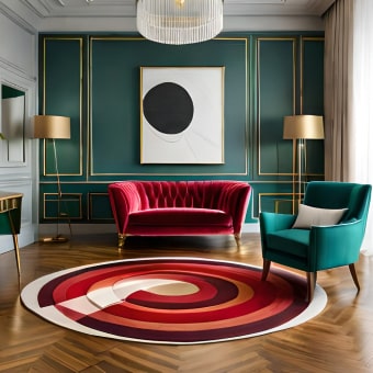
- Living room: oversize the rug, anchor seating with a strong coffee table silhouette, and hang art at proper eye level so the wall feels curated (not floating).
- Bedroom: use full drapery panels, layered bedding, and matching bedside lighting to create hotel-level calm.
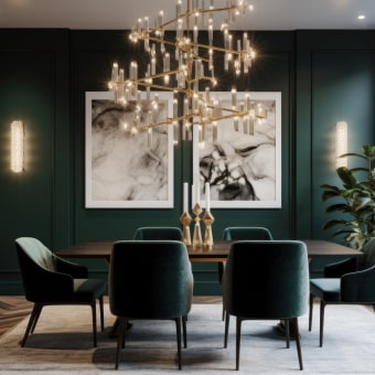
- Dining room: invest in comfortable seating proportions and a statement pendant hung to flatter faces and tabletops.
- Entry: add a console with a mirror or art, plus a defined catchall zone to keep the first impression pristine.
AI-Enhanced Inspiration Without Losing Taste
Simple prompts to generate usable interior concepts
| Goal | Prompt ingredients to include | What to extract |
|---|---|---|
| Define a style direction | Room type + style + era + mood + key materials | Palette, materials list, hero pieces |
| Improve a layout | Room dimensions + fixed elements + priorities | Furniture plan, circulation routes |
| Refine finishes | Existing floor color + desired metal + stone preference | Finish pairings, do/don’t list |
Styling Rules That Keep Spaces Elegant (Not Overdone)
Recommended Digital Guides for a Polished Plan
- A Modern Guide to Luxury Home Interior Design | Digital Download eBook for Elegant Interiors, High-End Decorating, and AI-Enhanced Design Inspiration ($4.99)
- How to Pick Dining Chairs Checklist | Digital Download Guide for Choosing the Perfect Dining Room Chairs, Home Decor, Dining Table Seating, Interior Design Tips ($5.99)
Quick details
| Format | Price | Best for | Availability |
|---|---|---|---|
| Digital download eBook | 4.99 USD | Luxury-inspired room planning and refined styling | In stock |
FAQ
What are the easiest changes that make a home look more luxurious?
Layer lighting with dimmers, use properly sized rugs and art, upgrade hardware, add full-length drapery, and keep the palette restrained while bringing in tactile textures like linen, wool, leather, or bouclé.
How can AI help with luxury interior design without making it look generic?
Use AI to explore several directions quickly, then lock in real-world constraints: a consistent palette, a curated materials list, correct scale, and one repeating signature motif that shows up subtly across the room.
What color temperatures work best for elegant interiors?
2700K–3000K works well for most living spaces, especially when paired with dimming. Warmer light tends to make stone, wood, and textiles look richer and more flattering at night.








Leave a comment