Luxury Interior Design Checklist: Elegant Room Upgrades
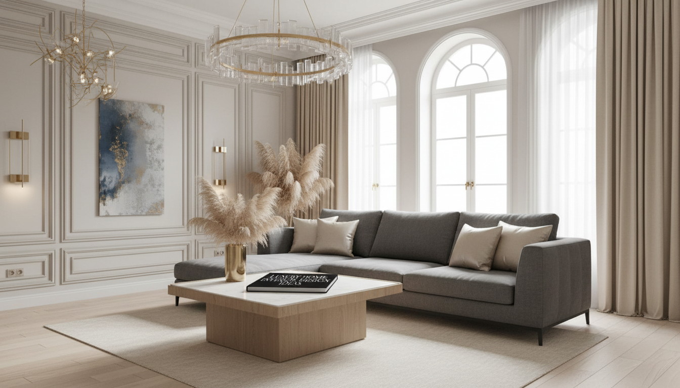
Luxury Interior Design Ideas Checklist for Elegant Living
Luxury interiors feel intentional: a clear layout, elevated materials, disciplined color choices, and lighting that makes every surface look its best. Use the checklist below to refine each room—whether the look leans modern glam, classic elegance, Art Deco, or contemporary minimalism—without losing cohesion. For more guidance, see Interior Designer New York – Affordable Interior Design by Uploft.
Start with a luxury baseline: layout, scale, and negative space
Before shopping, set the “bones” of the room. Expensive-looking spaces rarely start with accessories—they start with decisions about function, circulation, and what not to add. For further reading, see Best Interior Design Books You Need To Download Today For Free!.
- Define the purpose in one sentence: entertaining, relaxing, working, or multi-use. This keeps every purchase aligned.
- Map circulation paths: keep primary walkways open and never let a chair back block a door swing or a natural traffic line.
- Prioritize scale: one properly sized anchor piece (sofa, bed, dining table) typically reads more elevated than several smaller “almost” pieces.
- Use negative space deliberately: luxury often reads as “room to breathe,” not “room to fill.”
- Give each room a focal point: fireplace wall, statement headboard, sculptural chandelier, or a single commanding artwork—then keep supporting elements quieter.
Choose a style lane (or a controlled blend) that stays consistent
A cohesive style is the invisible thread that makes a home feel curated. If multiple styles are competing, even beautiful items can feel random.
- Modern glam: high-contrast palettes, reflective finishes (brass, polished nickel), plush textures (velvet, faux fur), and bold lighting silhouettes.
- Classic elegance: layered neutrals, symmetry, tailored upholstery, traditional profiles, and refined details like welting, pleating, and trim.
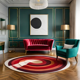
- Art Deco: geometric motifs, stepped forms, lacquered surfaces, jewel tones, and metals paired with marble or glass (see the historical references at Encyclopaedia Britannica).
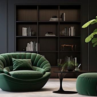
- Contemporary minimalism: fewer, better pieces; warm minimal palettes; hidden storage; and an emphasis on proportion and natural light.
Mixing rule that stays polished: aim for roughly 70% dominant style, 20% secondary, and 10% accent. This prevents “visual arguments” across finishes, silhouettes, and eras.
Build a high-end palette and materials plan
Luxury materials don’t have to mean fragile. The goal is a controlled palette, repeat finishes on purpose, and invest in the surfaces you touch every day.
- Choose a core neutral: warm white, greige, taupe, soft charcoal—then select one accent color family (emerald, sapphire, cognac, oxblood, or deep teal).
- Repeat metals intentionally: pick one primary metal finish and one secondary. A third can appear only in small accents.
- Balance sheen: matte walls + satin drapery; glossy lacquer + textured stone; polished metal + natural wood.
- Upgrade “touch points” first: cabinet hardware, faucets, door levers, switch plates, and drawer pulls deliver a surprisingly big lift.
- Use real (or realistic) natural materials: stone, wood, wool, linen, leather, or high-quality performance versions that keep the look tailored.
Luxury materials and where they work best
| Material/Finish | Best Rooms | Why It Looks Elevated | Watch-Out |
|---|---|---|---|
| Marble or stone (real or engineered) | Kitchen, bath, entry, fireplace surround | Natural veining and weighty presence | Too much veining can overwhelm small spaces |
| Brass / polished nickel | Lighting, hardware, mirrors, bar area | Reflects light and reads “tailored” | Mixing too many metal tones can look accidental |
| Velvet / bouclé upholstery | Living room, bedroom seating | Depth, softness, and luxe texture | Needs strong silhouettes to avoid looking slouchy |
| Rift/quarter-sawn wood | Dining, built-ins, cabinetry | Consistent grain and craftsmanship feel | Clashing wood undertones create visual noise |
| Glass + geometric details | Art Deco accents, bar cart, lighting | Adds sparkle and structure | Overuse can feel cold; add soft textiles |
Lighting checklist: the fastest way to make a room feel expensive
Lighting is often the difference between “nice” and “wow.” Strong lighting plans are layered, dimmable, and consistent in color temperature.
- Layer lighting: ambient (ceiling), task (reading/vanity), and accent (picture lights, sconces, LED strips).
- Upgrade one statement fixture first: entry or living room sets the tone immediately.
- Keep warmth consistent: in living spaces, 2700K–3000K is typically flattering; avoid mixed temperatures in the same sightline.
- Add dimmers: luxury spaces flex from bright function to a low evening glow.
- Use symmetry where it counts: matching bedside lamps or balanced sconces around a mirror reads intentional.
For more visual inspiration on how designers layer fixtures and finishes, explore Architectural Digest’s interior design coverage or browse room examples on Houzz.
Room-by-room refinement checklist (quick wins with big impact)
For a structured, save-and-reuse approach, the Luxury Home Interior Design Ideas Checklist (digital download) helps track your palette, materials, and room priorities so every update feels connected.
Styling rules that keep elegance (not clutter)
Put it into action with a printable checklist
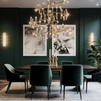
If the dining area is the next focus, the How to Pick Dining Chairs Checklist (digital download) helps narrow scale, comfort, and proportion so seating looks tailored to your table and space.
To keep luxury spaces feeling pristine day-to-day—especially with light rugs and high-sheen floors—consider streamlined maintenance tools like the Smart Home Robot Vacuum Cleaner with Mop & Automatic Dust Collection.
FAQ
What makes an interior look luxurious without a full renovation?
Focus on scale (fewer, stronger pieces), layered lighting with dimmers, cohesive metal finishes, upgraded touch points like hardware and switch plates, and high-quality textiles such as wool rugs and lined drapery.
Can modern glam and contemporary minimalism work together?
Yes—keep minimalism as the structure (clean lines and negative space) and add glam selectively with one reflective metal, one plush texture, and a single statement light to avoid visual clutter.
How many metal finishes should be in one room?
Usually two: a primary finish and a secondary. A third can appear only in small accents, and each finish should repeat at least twice so it looks intentional.









Leave a comment