AI Moodboards: A Fast Workflow for Designers & Brands
Why AI Moodboards Work (When You Direct Them)
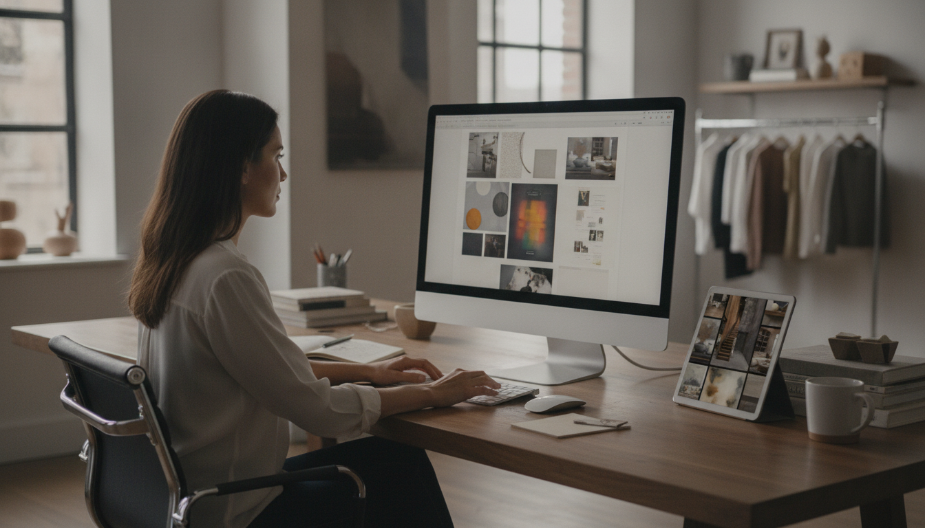
AI can dramatically speed up early-stage visual exploration, especially when a project starts as a vague feeling—“modern but cozy,” “premium but approachable,” “editorial but warm.” The advantage isn’t that AI replaces taste or strategy; it’s that it generates enough visual options to help decisions happen sooner. A strong moodboard still depends on clear goals, consistent criteria, and smart curation. The workflow below turns an idea into a usable set of references for brand identity, campaigns, product design, or content styling—faster, with fewer dead ends.
Start with a Creative Brief That AI Can Actually Use
Before generating anything, make the moodboard’s role specific. Is it guiding a brand identity, a seasonal campaign, a website refresh, packaging, a photoshoot, or social content templates? That single decision determines what you’ll collect and what you should ignore.
Next, write 5–10 descriptors that can be judged visually. Strong examples include “warm neutrals,” “quiet luxury,” “playful geometric,” “handmade texture,” or “high-contrast editorial.” Avoid fuzzy words that don’t show up on the page (like “innovative”) unless you translate them into visual behaviors (like “asymmetrical layouts” or “unexpected color blocking”).
Lock constraints early: audience, price point, medium (web vs. print), and real-world production limits (materials, lighting, locations, budget). Finally, build a quick “must include / must avoid” list to prevent generic outputs—like “include natural fibers” and “avoid neon gradients,” or “avoid stock-photo smiles.”
Choose the Right AI Inputs: Words, Images, and Style Anchors
AI moodboards improve when inputs are mixed and intentional. Use a short concept statement, 3–8 style adjectives, and 1–3 reference images that represent direction—even if they aren’t the final look. Think of reference images as anchors for a few specific attributes: palette, composition, texture, and era.
When possible, use one anchor per attribute: one image for color temperature, one for typography vibe, one for photography style. If starting from scratch, generate two contrasting directions first (for example: “minimal and airy” vs. “rich and cinematic”). Save both so stakeholders can choose a route quickly, then narrow the winning direction with tighter constraints.
A practical habit: maintain a swipe-file folder of reusable anchors—materials, patterns, lighting setups, layout structures, and brand moments you keep returning to.
AI Moodboard Inputs and What They Control
| Input Type | Best For | Tips to Avoid Generic Results |
|---|---|---|
| Short concept statement | Overall direction and narrative | Include audience + context (e.g., boutique wellness brand, not just “wellness”) |
| Style adjectives | Aesthetic tone and visual language | Pair opposites to refine (e.g., “minimal but tactile,” “bold yet calm”) |
| Reference images | Consistency in palette/composition/texture | Use 2–3 anchors max per iteration to prevent muddy outputs |
| Color targets (hex or named palettes) | Palette cohesion | Limit to 4–6 colors; assign roles (primary, accent, background) |
| Material/texture keywords | Surface feel and realism | Specify fiber, finish, and lighting (matte linen, glossy lacquer, soft daylight) |
Generate Fast Variations, Then Curate Like a Creative Director
Speed comes from short iteration cycles. Generate 10–20 visuals, select 6–10 winners, then regenerate based on what’s already working. This prevents the common trap of “chasing what’s missing,” which often produces noisy, inconsistent boards.
Curate hard for consistency. Remove images that are interesting but off-brief—moodboards are about direction, not entertainment. A useful method is to group your selections into lanes: color, typography, photography, illustration/icon style, layout, materials, and patterns. This reveals gaps immediately (for example, strong photography but no texture references).
Add intentional contrast: include 1–2 boundary images to clarify what the direction is not. Stakeholders often align faster when they can see the edge of the taste boundary.
Turn a Collage into a Usable System: Palette, Type, and Visual Rules
A moodboard becomes genuinely usable when it outputs decisions. Start by extracting a limited palette and labeling roles: primary, secondary, neutral base, and 1–2 accents. More than two “loud” accents tends to create a brand that looks undecided.
For professional guidance on process and decision-making, design thinking resources from Nielsen Norman Group are a solid reference point, and best-practice standards like WCAG help keep visual direction compatible with accessible interfaces.
Build Digital Moodboards That Present Well to Clients and Teams
Common Pitfalls When Using AI for Moodboards (and How to Fix Them)
Legal and usage confusion: treat AI images as inspiration. For final assets, use licensed imagery, original photography, or commissioned illustration, and lean on professional standards like AIGA’s professional practice resources to keep deliverables and usage expectations clear.
Helpful Digital Downloads
For a structured, repeatable workflow, the digital guide How to Use AI to Create Moodboards | Digital Guide for Designers, Creatives, Entrepreneurs, and Branding Inspiration helps turn scattered inspiration into a board that can actually guide brand and content decisions.
If the moodboard is for interiors or product styling, the How to Pick Dining Chairs Checklist | Digital Download Guide for Choosing the Perfect Dining Room Chairs, Home Decor, Dining Table Seating, Interior Design Tips pairs well with a visual direction by turning aesthetics into practical selection criteria.
FAQ
What should be included in a moodboard for branding?
Include a clear tone statement, a limited color palette, typography direction, imagery style (photography/illustration), textures/material cues, and 3–5 visual rules (do/don’t) that guide future design decisions.
How many images should a digital moodboard have?
Typically 12–25 curated items: enough variety to show range, but not so many that the direction becomes unclear. Use one hero image plus grouped supporting references.
Can AI-generated images be used as final brand assets?
Often they’re best treated as inspiration and direction-setting. For final deliverables, confirm licensing/rights and consider using licensed stock, original photography, or commissioned illustration for reliable usage rights.








Leave a comment